Branding
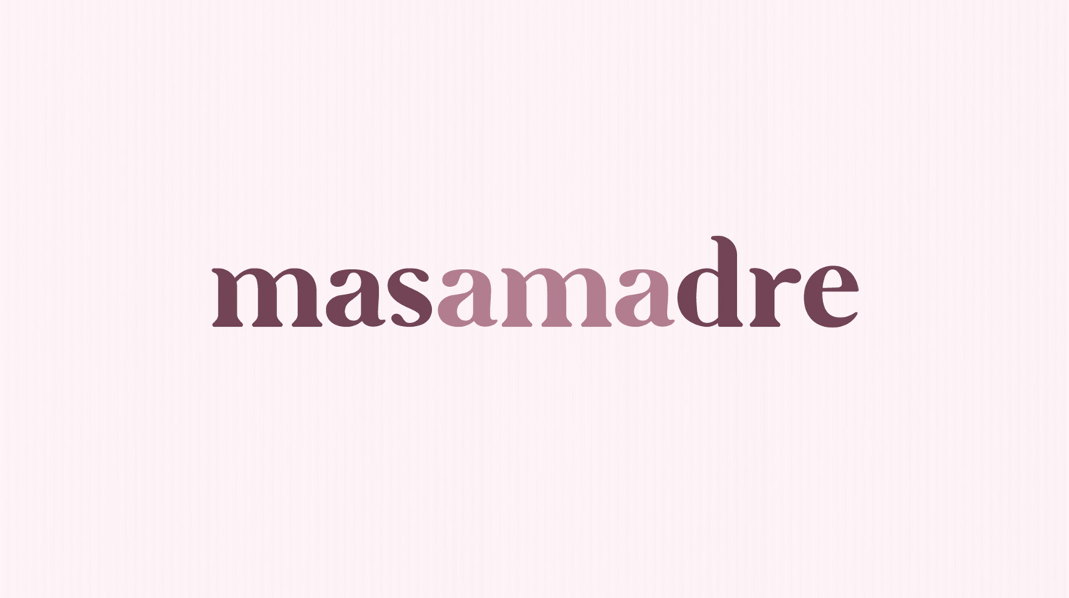
MASAMADRE
The objective of this project was to create a logo and other materials for an agency specialized in food content creation.
Tools:
Illustrator, Adobe XD, Photoshop
Illustrator, Adobe XD, Photoshop

Another aspect to highlight from the logo is that the letters "ama" have a different color, therefore spelling the equivalent to "love", to associate with the love that the agency puts into all of their projects.
The name for the brand comes from the Spanish word for sourdough starter, which is why it being a live being, the intention was to emulate the same organic feeling.
For this project, a brochure and a website were as well designed for sales purposes, showcasing the experience and services the agency has to offer.
MINICREADORES
Logotype designed for a children contest, wich consisted in inviting kids to recreate already existing crafting videos, hence the name of the project (mini=small=kids, creadores=creators=crafters).
Tools:
Illustrator, Photoshop, After Effects
Illustrator, Photoshop, After Effects
The rocket in the logo is a metaphor for letting the imagination fly, same resource used in the campaign video.
The project was sponsored by Comex, a paint company, so the prize was a makeover of the winner kid's bedroom.
SOTOL CASCABEL AZUL
The objective was to create a logo for a traditional Mexican beverage named Sotol (which is somewhat similar to Mezcal or Tequila). The logotype was inspired by Mexican ancient god Quetzalcoatl.
Tools:
Illustrator, Photoshop
Illustrator, Photoshop
A background texture, which resembles traditional Mexican style, was created to use on the bottle label, as well as in other materials such as business cards or presentations.
In contrast with the traditional style of the logotype and colors, the label is in part transparent and with a triangular shape to make it a bit more modern and appeal to younger audiences.
